When a visitor clicks a link to your website, a silent countdown begins. Within two to three seconds, that visitor expects your layout to stabilize, your text to become readable, and your primary visuals to snap onto the screen. If your page stalls behind a spinning loading wheel, human patience runs out quickly—and search engine algorithms take notice.
Learning how to improve website speed is no longer an optional task reserved for senior systems engineers. Whether you manage a content-heavy WordPress blog, an online store, a company landing page, or a web utility platform, site performance directly dictates your bounce rate, conversion rate, and Google search visibility.
However, many website owners fall into the trap of thinking speed optimization requires expensive server upgrades or complex code rewrites. In reality, over 80% of front-end performance gains come from mastering three foundational pillars: Image Optimization, Responsive Design, and Browser Caching.
In this complete, step-by-step guide, we will break down how modern web performance works, how to diagnose what is slowing your pages down, and how to combine free browser-based tools at RupaaCompress with smart server settings to make your website load in a fraction of a second.
Why Website Speed Is Make-or-Break for Your Online Presence
Before changing a single setting on your website, it helps to understand how speed impacts both human behavior and search engine rankings.
1. Google’s Core Web Vitals and Search Rankings
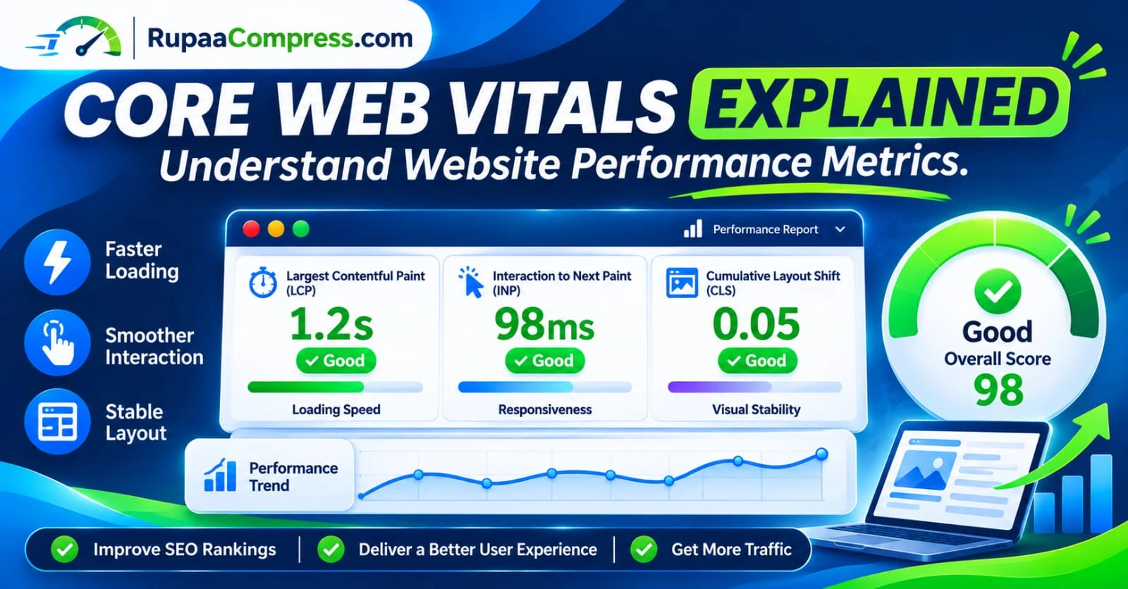
Google evaluates page experience using a set of real-user performance metrics known as Core Web Vitals. Three primary measurements determine whether your site passes or fails this assessment:
- Largest Contentful Paint (LCP): Measures how long it takes for the largest visible element in the viewport—almost always a hero banner image or featured blog graphic—to fully render. To pass, your LCP must occur within 2.5 seconds of the page starting to load.
- Interaction to Next Paint (INP): Measures how quickly your page responds when a user clicks a button, taps a menu, or interacts with a form. Heavy scripts and oversized media files decoding on the main browser thread can freeze responsiveness.
- Cumulative Layout Shift (CLS): Measures visual stability. Have you ever tried to tap a link on your phone, only for a late-loading image to suddenly pop in and push the text down the screen? That frustrating jump is a layout shift.
When you improve website speed through proper media handling and caching, you directly solve LCP and CLS bottlenecks, giving your pages a measurable ranking advantage over slower competitors.
2. User Retention, Bounce Rates, and Conversions
Every extra megabyte of data your page requires acts as a tax on your visitors. On desktop fiber connections, a 5 MB webpage might load in two seconds. On a congested mobile network or rural cellular connection, that same 5 MB page can take ten seconds or more. By lowering page weight and minimizing repeat network requests, you keep mobile readers engaged, lower your bounce rate, and guide more visitors toward your call-to-action buttons.
Pillar 1: Image Optimization (The Biggest Immediate Win)
If you want to push your performance needle into the green zone today, start with your media library. Across the web, images account for the single largest portion of downloaded bytes on almost every webpage.
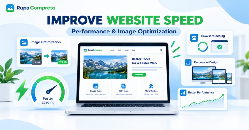
Look at the classic scenario illustrated in our performance banner: a raw landscape photograph uploaded directly to a website weighs a massive 2.8 MB. After passing through a proper compression and sizing workflow, that exact same visual drops down to 320 KB—nearly a 90% reduction in file weight—without any noticeable difference in sharpness on the laptop screen.
Here is the exact four-part workflow to optimize every image on your site:
1. Compress Images Before Uploading
Never upload unedited camera photos or uncompressed design exports directly into WordPress or your CMS. Instead, run them through the Compress Image tool on RupaaCompress.
- Drag a single photo—or an entire folder of website assets—directly into your browser workspace.
- Use the live quality slider (typically between 75% and 82%) or set an exact target size.
- Inspect the visual details using the interactive before/after comparison slider.
- For icons, thumbnails, and standard in-post graphics, aim to bring files down even further—check out our dedicated tutorial on how to compress images to 100 KB or less for ultra-lightweight results.
2. Switch to Next-Generation Formats (WebP and AVIF)
Traditional formats like JPG and PNG have served the web for decades, but modern compression algorithms can store the same visual data in a fraction of the space.
- Converting standard JPGs and PNGs into WebP format routinely cuts another 25% to 35% off your file size while supporting both photographic gradients and transparent backgrounds.
- To see how JPG, PNG, WebP, and AVIF compare across different use cases, read our complete guide on the best image format for websites in 2026.
- With the Convert Image tool on RupaaCompress, you can batch-convert dozens of legacy PNGs, JPGs, or Apple HEIC photos into WebP in one pass and download them all as a clean ZIP archive.
3. Strip Unnecessary EXIF Metadata
Digital cameras and smartphones embed hidden metadata inside every photo—including camera settings, color profiles, edit histories, and even GPS coordinates. None of this invisible text helps your webpage render faster, and it can pose a privacy risk. Processing your graphics locally through RupaaCompress allows you to cleanly remove EXIF data from photos, shaving off wasted kilobytes while protecting your privacy.
4. Use Native Lazy Loading for Below-the-Fold Media
If your blog post contains fifteen step-by-step screenshots, a visitor landing at the top of the page only sees the first image (the featured hero graphic). Forcing their browser to download all fifteen images at once chokes their bandwidth.
- Keep your hero image eager: Your top featured image (the LCP element) should load immediately (
loading="eager"orfetchpriority="high"). - Lazy-load everything below the fold: Add the HTML attribute
loading="lazy"to all images further down the page (WordPress handles this automatically for most content blocks). This tells the browser to wait and download lower images only as the reader scrolls down toward them.
Pillar 2: Responsive Design and Proper Image Sizing
The second core pillar of our website speed blueprint is Responsive Design. A truly responsive website doesn’t just shrink its visual layout to fit on a desktop monitor, a tablet, and a smartphone screen—it also adapts the actual dimensions of the assets sent to each device.
The Problem With “One-Size-Fits-All” Images
Imagine your desktop website features a wide hero banner that displays at 1600 × 900 pixels. When someone visits that same page on a smartphone, their screen viewport might only be 390 pixels wide.
If your website uses simple CSS (width: 100%) to visually squeeze that 1600-pixel image onto a 390-pixel phone screen, the mobile browser still has to download over 1.4 million pixels when it only needs about 85,000 pixels. Not only does that waste cellular data, but the phone’s mobile processor also has to work harder to decode and downscale the oversized graphic in memory.
How to Optimize Images for Responsive Design
- Never Upload Images Larger Than Their Maximum Display Container: Before uploading any graphic, check the maximum width of your website’s layout. If your blog post column is
800pxwide on desktop monitors, use the Resize Image tool on RupaaCompress to cap your content images at800pxor1200pxmax width. For uniform product grids or author avatars, use the Crop Image tool (see our Crop to Square guide) so every thumbnail shares exact, predictable proportions. - Leverage Responsive
srcsetAttributes: Modern content management systems like WordPress automatically generate multiple thumbnail sizes (medium,large,thumbnail) whenever you upload a cleanly sized master image. WordPress then outputs an HTMLsrcsetattribute that lists every available size. This allows a desktop monitor to pick the full1200pximage while a smartphone automatically requests the lightweight400pxversion. - Always Define Explicit
widthandheightAttributes: Ensure your HTML<img>tags include explicit width and height numbers. When the browser knows an image’s aspect ratio before the file finishes downloading, it reserves the exact empty box on the screen—completely eliminating Cumulative Layout Shift (CLS) across desktop, tablet, and mobile layouts.
Pillar 3: Browser Caching (Instant Speed for Returning Visitors)
While image compression and responsive sizing make the first visit to your website fast, Browser Caching makes every subsequent page view nearly instantaneous.
How Browser Caching Works
When a first-time visitor opens your homepage, their browser downloads your logo, navigation icons, CSS stylesheets, fonts, and article images from your web server.
Without browser caching enabled, if that visitor clicks to read a second article on your site—or returns tomorrow—their browser has to download your logo, fonts, and stylesheets all over again from scratch.
Browser caching solves this by sending special HTTP instructions (Cache-Control and Expires headers) from your server to the visitor’s browser. These headers tell the browser: “Save a copy of these images and stylesheets locally on the user’s device for the next 30 to 365 days. Next time they load a page on this domain, load those files straight from their local storage instead of asking the server again.”
Why Image Optimization and Browser Caching Are Best Friends
Browser caching and image optimization work together as a two-stage rocket:
- Smaller files fill the cache faster: Mobile browsers allocate limited storage space for cached website files. When you compress a hero image from
2.8 MBdown to320 KB, the browser can write it to local cache memory faster and keep it stored longer without purging it to free up disk space. - Site-wide assets load in 0 milliseconds on Page 2: Once your compressed brand logo, footer badges, and category thumbnails are cached on Page 1, navigating to Page 2 requires zero network downloads for those shared visuals.
How to Enable Browser Caching on Your Website
- On WordPress: You can enable browser caching with a single click using reputable performance plugins like WP Rocket, LiteSpeed Cache (if your host runs LiteSpeed servers), W3 Total Cache, or WP Super Cache.
- Via cPanel /
.htaccess(Apache Servers): You can set expiration rules directly in your.htaccessfile using themod_expiresmodule—typically setting static images (image/webp,image/jpeg,image/png) to cache for 1 year (access plus 1 year), as image files rarely change once published. - Via a Content Delivery Network (CDN): Services like Cloudflare automatically handle browser caching rules and serve your compressed images from edge servers located geographically close to your visitors.
Step-by-Step Checklist: Audit and Speed Up Your Website Today
Ready to put all three pillars into action? Follow this practical five-step workflow to measurably improve website speed on any new or existing page:
Step 1: Run a Baseline Speed Test
Open Google PageSpeed Insights (pagespeed.web.dev) or GTmetrix and paste the URL of your homepage or your most popular blog post. Look closely at the Diagnostics section:
- Does it flag “Properly size images”? (You need Resize Image).
- Does it flag “Efficiently encode images” or “Serve images in next-gen formats”? (You need Compress Image and Convert Image).
- Does it flag “Serve static assets with an efficient cache policy”? (You need Browser Caching).
Step 2: Batch-Optimize Your Heavy Images Locally
Download the flagged oversized images from your webpage—or grab the folder of photos for your next article—and open RupaaCompress:
- Resize: Open the Resize Image tool and scale any massive 3000px+ photos down to the actual pixel width of your website template (e.g.,
1200pxfor full-width banners,800pxfor standard blog images). - Convert: Open the Convert Image tool and convert heavy PNGs or JPGs into modern WebP files.
- Compress: Drop the batch into Compress Image and dial the slider to reduce your multi-megabyte files into lean kilobyte files (just like turning a
2.8 MBfile into320 KBor less). - Download as ZIP: Grab your entire optimized batch in one click. Because RupaaCompress runs 100% locally in your browser using the Canvas API, there is zero server upload wait time and complete privacy for your files.
Step 3: Re-Upload and Verify Responsive Markup
Upload your newly compressed images to your website, make sure they have descriptive filenames and alt text, and verify that they display cleanly across desktop, tablet, and mobile previews.
Step 4: Turn On Browser Caching and Page Compression
Check your hosting panel or WordPress caching plugin to confirm that Browser Caching is active for static media files (JPG, PNG, WebP, SVG, CSS, JS) and that text compression (GZIP or Brotli) is enabled on your server.
Step 5: Re-Test and Track Your Performance Gains
Run your URL through PageSpeed Insights a second time. You should immediately see your total page weight drop, your Largest Contentful Paint (LCP) time shrink, and your overall performance score climb upward.
Frequently Asked Questions (FAQs)
1. What is the fastest way to improve website speed without coding?
The fastest non-technical way to speed up any website is image optimization. Because images make up the majority of a webpage’s byte size, resizing and compressing photos before uploading them (for example, shrinking a 2.8 MB photo down to 320 KB) can cut page load times in half without touching a single line of code.
2. What is a good file size for website images?
For large full-width hero banners, aim to keep your compressed file size between 150 KB and 350 KB. For standard in-article blog photos and product images, aim for 50 KB to 150 KB. For small thumbnails, icons, and avatars, aim for under 50 KB.
3. Does browser caching compress my images?
No. Browser caching and image compression solve two different parts of the speed puzzle. Image compression shrinks the file size so the first download over the internet is fast. Browser caching stores that already-compressed file on the visitor’s computer or phone so that repeat page views don’t have to download it again. You need both for maximum performance.
4. Why are my images still flagged on mobile speed tests even after compression?
If an image is already compressed to a low quality setting yet still gets flagged on mobile PageSpeed tests, the issue is usually pixel dimensions (Responsive Design). Make sure you have resized the physical width and height of the image using the Resize Image tool on RupaaCompress and that your CMS outputs responsive srcset sizes for smaller mobile screens.
5. Is it safe to optimize client or business website images in an online compressor?
Many traditional online compressors upload your files to remote cloud servers, which can be a privacy concern for client projects or unreleased products. RupaaCompress processes every image 100% locally inside your own web browser—your files never leave your computer or touch an external server.